This is an older analysis from 2020, but I figured I could post it here too, as it can still prove useful to someone!
The idea behind this little project was to draw my mascot character
Luv as a fan stand in 4 different iterations that appear throughout JoJo's Bizarre Adventure. I'm very passionate about both character design and style analysis, so this seemed like a really fun thing to work on! (And it was!)
Here's the four designs side by side, and I'll go over each of them in this post.
 PART 3-4
In parts 3 and 4, the non-object stands look quite organic, and many of them actually look like living creatures. You look at stuff like Star Platinum, Magician’s Red, Tower of Gray, Hanged Man, Empress etc and they could all pass as creatures. Because this was early in stand development, there are few unifying factors among them, because Araki was still looking for the right aesthetic. Hierophant Green was the first stand to have what later became standard ‘stand eyes’ - eyes with vertical lines across them, which make them look particularly artificial.

As part 3 goes along, stands are slowly starting to take a more unified shape; The Fool, Judgement, Osiris and Atum, and also Cream to an extent, all start looking more artificial/robotic. ‘Stand eyes’ become more common.
Here’s an excerpt from Araki’s interview in Jojonium Vol.15;
- Quote :
- When I design Stands, I often take inspiration from artifacts such as clothing, masks, and dolls from indigenous peoples. Once I fuse that aspect with something biological or mechanical, it makes a really unique design. Originally, I imagined Stands as being something inorganic powered by life force, so it makes sense that a lot of their designs are fusions between living beings and machines. The Fool’s design starts out with a dog, and then adds on a Native American mask and the tires of a car. I think The Fool really represents my ideal design for a Stand.

For the design of my stand, Totsugeki Love Heart, I heavily leaned on the appearance of Star Platinum in this iteration because it was the closest to his actual design. I took the style of part 3 anime for colouring.
The main palettes in the anime also seem fairly uninspired, almost sticking to colours you'd
expect to see, so I followed that with my design.
Part 4 has a similar approach to stands as later part 3, there are a few more organic ones (Killer Queen, Stray Cat, Pearl Jam), but most others have some artificial aspect to them.
PART 5
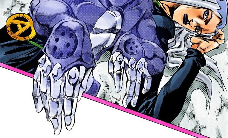
Part 5 has the first bigger shift in stand design. This is where stands stop looking “soft”. A lot of them appear to be covered by harder surfaces, and their faces look like masks. There are always exceptions because while most stands tend to follow similar design rules, there’s really no
one way a stand can look, since we have object stands like Strength, Cream Starter and Beach Boy, and animal-esque stands like Clash. Talking Head, for example, seems almost entirely organic aside from its eyes.
Speaking of eyes, in part 5 there are VERY few exceptions to the ‘stand eyes’ rule, ‘normal’ organic-looking eyes are getting exceedingly rare.

Many part 5 stands have an “exposed” midriff, their designs often look like they consist of a chest piece and pants.
Some more things a lot of stands tend to have throughout parts are elbow and knee guards or segmented-looking joints, studded knuckles, and segmented fingers. The latter two appear in nearly every design.

My design follows these conventions, and the sash around his waist is attached with a pin on each side, as such accessory-type design aspects are fairly common in part 5.
Colour-wise, it's based on the part 5 anime. It was the first one I did, so I was a bit more biased with the colours I chose, making this one a bit less accurate. They are a bit off from the general part 5 palette, being more saturated.
PART 6
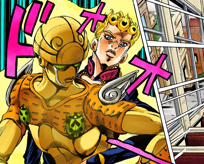
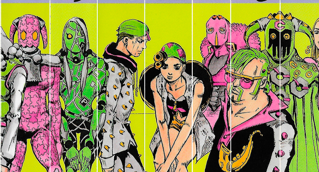
With part 6, one notable change I picked up on is that a lot of stands tend to have patterns on their bodies, which are distinctly different than the ‘armour’ patterns that part 5 stands have (Gold Experience, for example). Stone Free has little bumps all over, Kiss has stickers, Whitesnake has the GΔCT stripe pattern, and then you have Yo-Yo Ma and Planet Waves who seem to be textured.

Previously stands had minor patterning (with exceptions, as always), but that changes a bit in Stone Ocean. There are also several stands here that have no face, like Diver Down, Marilyn Manson and Jumpin’ Jack Flash.
Having mentioned Marilyn Manson, I might also point out that there are very few stands with any sort of hair or fur.
For this project, I put a lot of thought into the colours of my designs, as different variations of JoJo media have very different approaches to colour. For this one, I decided to follow Shueisha's official colouring. For the unaware; the colours of the official coloured JJBA manga were not chosen by Araki. This was the hardest one for me, because, in my opinion, most digitally coloured part 6 stands have pretty ugly palettes.
I skipped part 7 because it seems Araki tried doing something quite different with stands in this part, making their appearance less prominent as they work directly through their users instead. Because of that part 7 doesn’t really seem to have a unified stand design as the stands range from a spray, to a rope, to a mask, to a literal dinosaur, to balloons, and then to a few more common bio/mech stand designs. Among these, Civil War is a great example of what’s to come.
 PART 8
Part 8 is the furthest Araki pushed stand design thus far.
Stands in Jojolion are distinctly more artificial than they are organic.

You could mistake Star Platinum for a creature, even a human, but there’s no way you could mistake any of the Jojonium stands for something “real”.

Not all of them look as mechanical as Soft & Wet for example, but even those with most of their body looking soft don’t look like they are human, such as Nut King Call for example.

This was my favourite design to work on, because I absolutely love the otherworldly designs in Jojolion.
Nut King Call is one of my favourite stand designs, and I mostly chose it as a reference for my stand's Jojolion design.
Part 8 style was also obviously the most fun with colours, since I chose Araki's own coloured work as inspiration.
Araki uses very interesting combinations and his colour choices are often a little bit off the expected hue, which makes them really fun and exciting!
CONCLUSIONIf you are someone who is trying to design a stand that believably matches Araki's aesthetic, here's what I recommend:
If you follow the Jojolion pattern you’d probably be able to design something that looks like a stand the easiest, because these designs really pull forwards the essence of what matters in a stand design: the living artificial. It's also the culmination of Araki's visions for the idea of the stand, which he's been chasing ever since Stardust Crusaders.
If Jojolion stand aesthetic doesn’t quite appeal to you and you want a slightly more organic stand, then I’d recommend you look into part 5 & 6 stands as inspiration, as they have a great variety of designs you can analyse.
If you want to look into colour aesthetics for stands, then I recommend you look at Araki’s traditionally coloured pieces, not the anime or the digital colouring, as his colours are generally much more unusual, just like stands should be.
But of course, stands can also literally look like anything. They can be a boat or a cat flower.
None of these are rules, just suggestions for those who seek them <:


